
Empower yourself, elevate your brand, and enhance your surroundings with colors
Our emotions are powered by a variety of trigger points that have a great effect on our perceptions. Emotions are engraved in our memories based on what we experience throughout our lifetime. Have you ever wondered what influences our behavior when it comes to making decisions? and how many of these decisions are driven by logic and how many by our emotions?
According to a recent study, customers judge a product or service within a span of 90 seconds, and nearly 62- 90 % of this assessment is based on colors alone.
In this era of globalization, we have a sea full of options available at our disposal. What matters is not just the utility and technical skills of the product or service, but the consumer journey and customer experience.
The role of colors is not just limited to “making everything look pretty”, but there is a psychology behind it that is used to heighten all the five senses of consumers.
What is Color Psychology?
Color Psychology is the study of hues and its influences on human behavior. The application of color psychology spans across marketing, branding, UX/UI, fashion designing, interior designing, and well-being.
In the constantly evolving digital world, decisions are driven by all our five senses and this plays an important role in sensory marketing.
The realm of color psychology extends to all industries and is a key determinant towards building a strong brand association and driving consumer behavior.
Applications of color psychology in industries
| Industries | Application of Colors |
| Real Estate | Home décor during staging process of an open house. |
| Restaurants | 1.Fast food joints liberally use colors that stimulate hunger. 2.Fine dining restaurants use colors that create an elegant ambiance. |
| Service Based industries (Banks/Hospitals/Hotels) | 1.Company Logo 2.Website Aesthetics and User Experience 3.Banks – Credit card branding based on different segments of clients. 4.Banks – Queueing systems 5.Hospitals – Operation Theatre 6.Hotels – Interior design and décor of the hotel and rooms |
| Games | Attention grabbing and thought stimulating colors incorporates in the design of the game |
| Retail Stores | Visual merchandising |
| Creative Artists/Social Media | Fashion designers, stylists, makeup artists, visual artists, videographers use colors to enhance the aesthetics of their creative output. |
| Well Being | A colorful diet is packed with loads of nutrients to enhance health and well being |
Color Theory
The color theory provides guidance to designers and visual artists in understanding how colors communicate with their audience. The color wheel is used as a point of reference to create color schemes that are aligned with the client’s requirement.
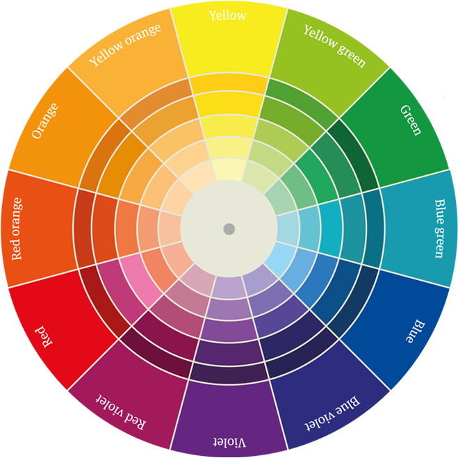
The Color Wheel
The color wheel is an illustrative guide that has been designed to develop a harmonious color palette by combining various shades and hues. This can be broken down into various quadrants. The cool colors are represented by blues and greens while the warm colors are represented by red, orange and yellow.
Image Courtesy: Kindpng
Sir Isaac Newton had first developed the color wheel in the 1700’s while passing white light through a prism which led to the discovery of the spectrum of light. It was believed that Sir Isaac Newton had a unique trait which made him correlate colors with musical notes suggesting that he may have had Synesthesia.
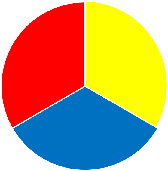
Primary Colors
Primary colors are distinct colors that cannot be created by mixing any other color /shade. Red, blue and yellow are primary colors in the world of art, computers and television screens.
Image Courtesy: Kindpng
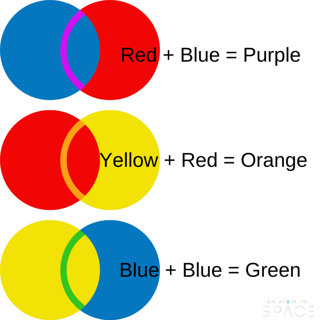
Secondary Colors
Secondary colors are obtained by mixing primary colors.
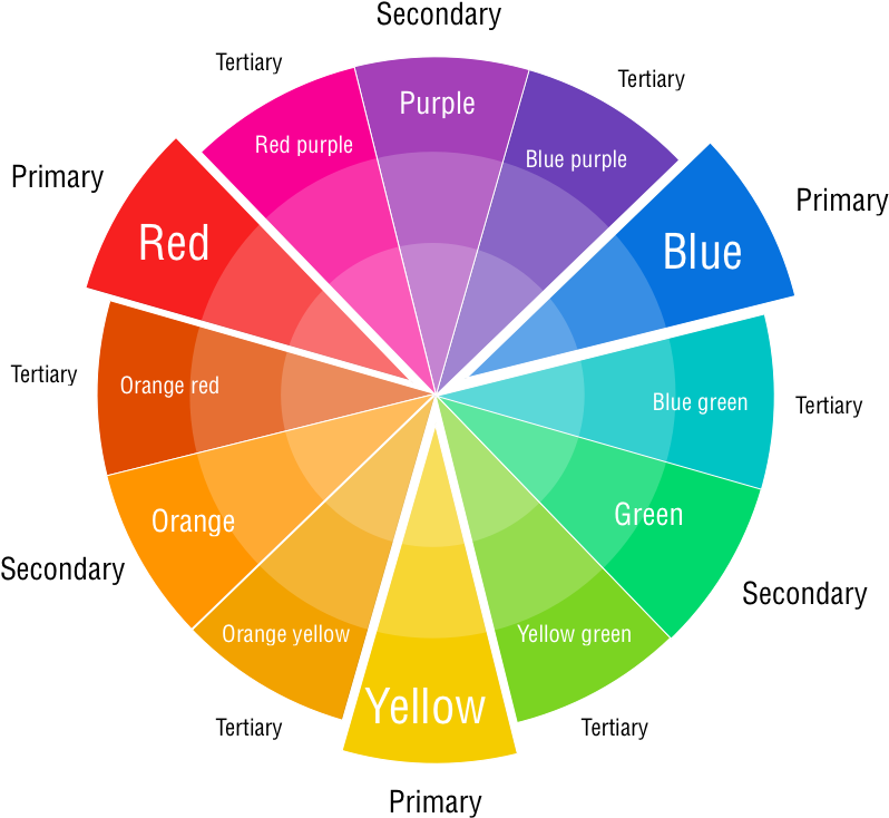
Tertiary Colors
Tertiary colors are created by combining a primary color with a secondary color. For Example: Blue (Primary color) and Green (Secondary color) combine to form Teal.
Image Courtesy: Kindpng
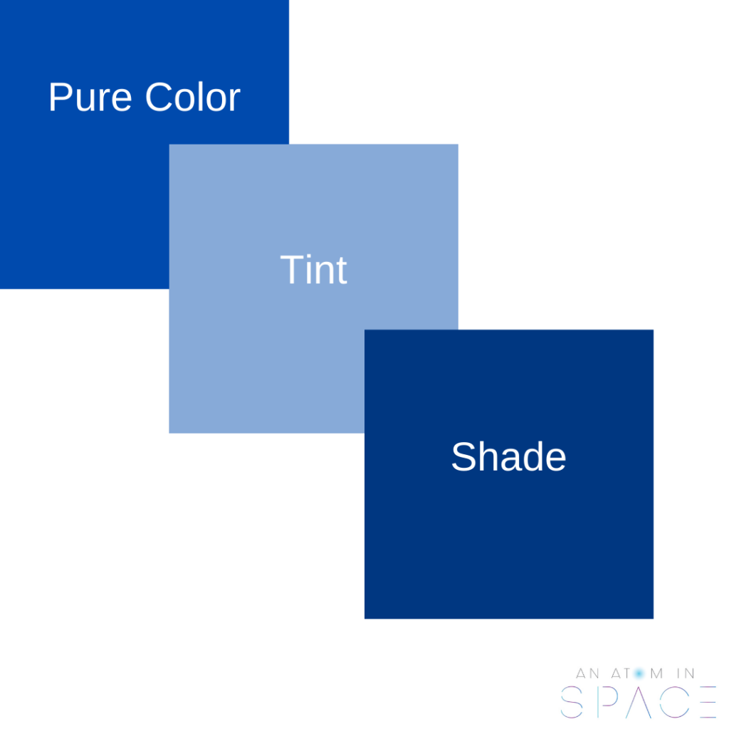
Shades and Tints
Shades and Tints add a range of variation to the color and can be altered based on the look and feel of the creative inspiration as well as the clientele being catered to.
Shades of color are derived by mixing color black to the pure color. The darker shade of the color adds depth and opulence if utilized correctly. Adding color white to the pure color creates a tint. Tints can be used to give a light and an elegant look and feel to the design.
Now that we know the basics of color psychology, watch out for our next post where we delve further into the meaning of these colors and their applications.
No responses yet